

Styles
Every style below rendered the same storyboard. Pass one with style=<id>, or pick a family in the questions and then the exact style.
Styles are inspired by public design languages. They use open fonts only and include no logos, trademarks or product screenshots. Contrast is checked against WCAG AA before anything renders, and colours that fail are nudged until they pass.
Match my project
style=match builds a style from your repo: shadcn and Tailwind CSS variables (including @theme and oklch values), tailwind.config, MUI, Chakra and Mantine themes, design-token files, next/font and Google Fonts, dark or light default, and a logo found in the repo. The skill tells you which values it detected and which it guessed.
You can also pass brand colours, style=#E11D48,#0EA5E9, or a website to match, style=https://example.com.
Modern SaaS
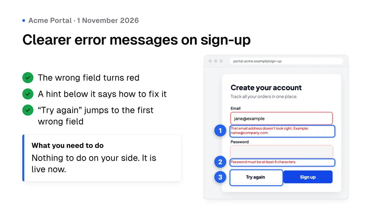
style=shadcnNeutral zinc palette, 1px borders, soft white cards. Calm and product-like.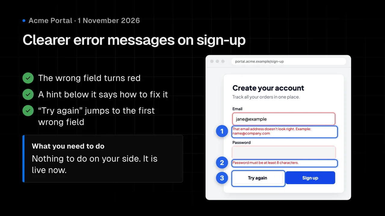
style=vercelMonochrome and high-contrast with hairline grids. Blue accent used sparingly.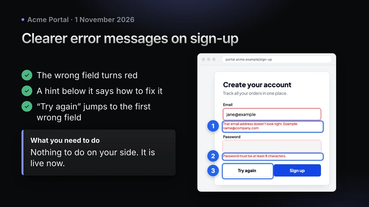
style=linearDark and sleek with soft radial glows, gradient headline text and blur-in motion.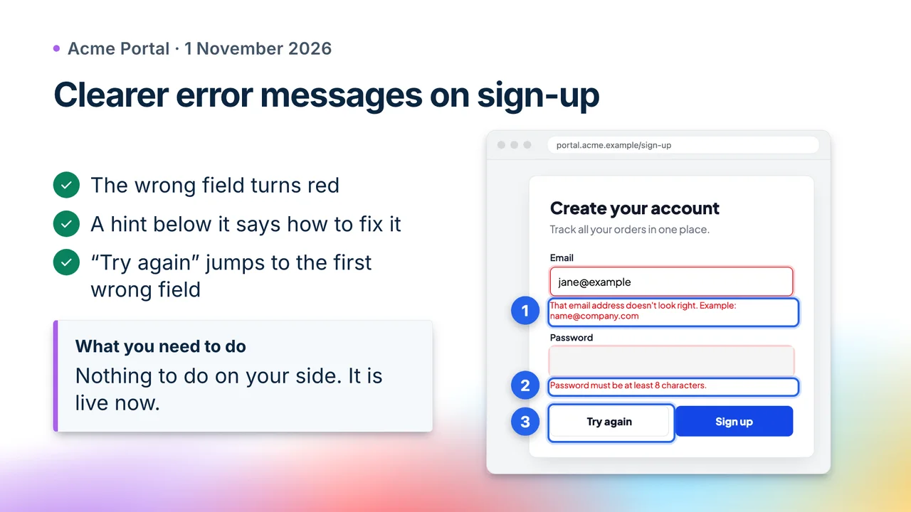
style=stripePolished fintech look: animated gradient mesh, slanted colour bands, navy type.Clean & friendly
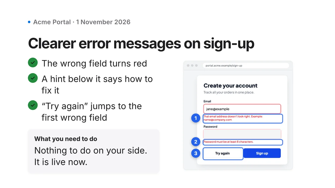
style=appleKeynote-like: huge headlines, lots of whitespace, slow and elegant motion.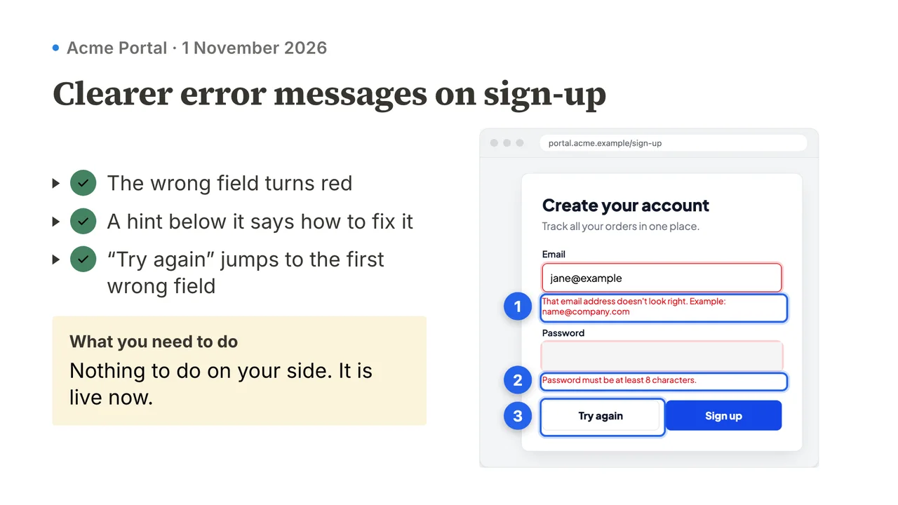
style=notionWarm document look with serif headings, tinted callout boxes and toggle lists.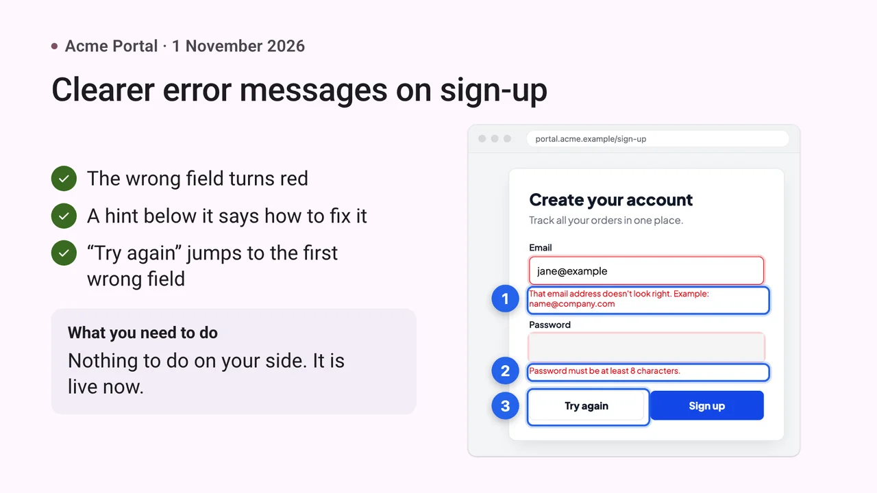
style=materialTonal surfaces, big rounded shapes and expressive but calm motion.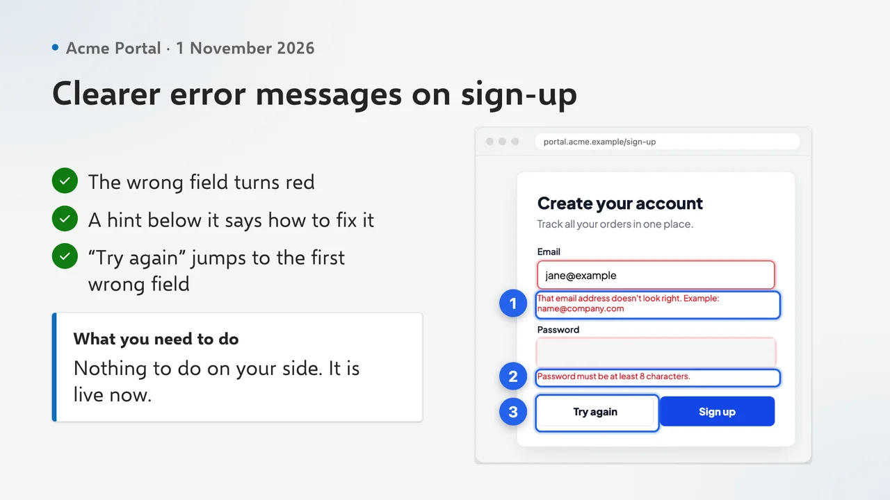
style=fluentEnterprise-familiar with layered Mica-like surfaces and a confident brand blue.Bold & creative
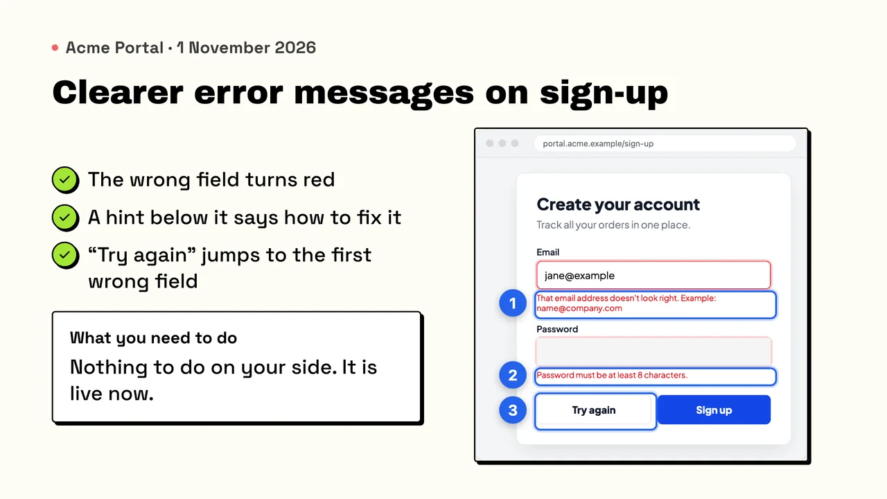
style=neo-brutalismThick black borders, hard offset shadows, flat bright fills and snappy motion.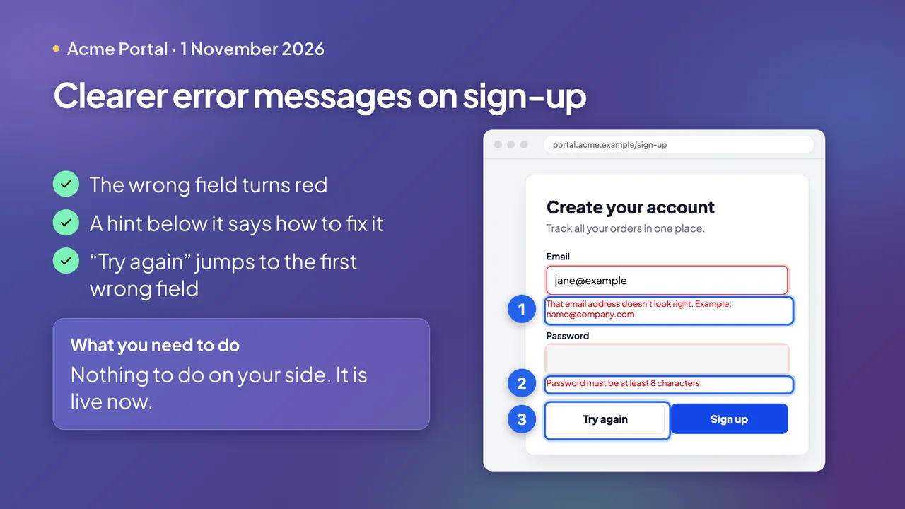
style=glassFrosted glass panels floating over a vivid purple-blue aurora gradient.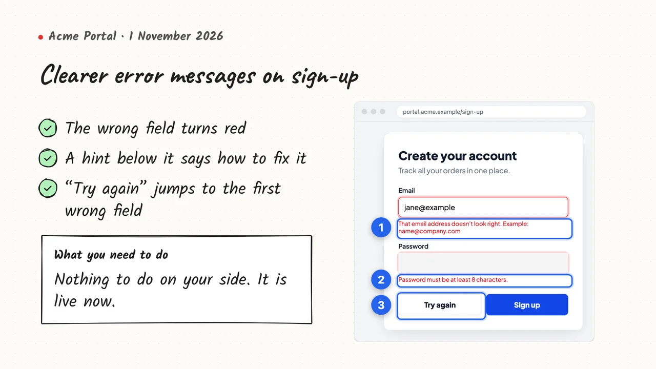
style=whiteboardHand-drawn sketch on paper with marker highlights and draw-on strokes.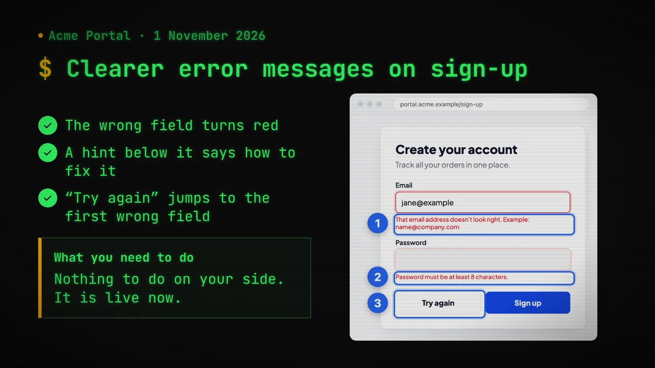
style=terminalRetro CRT: phosphor green monospace, typewriter text, scanlines. For technical audiences.Extended
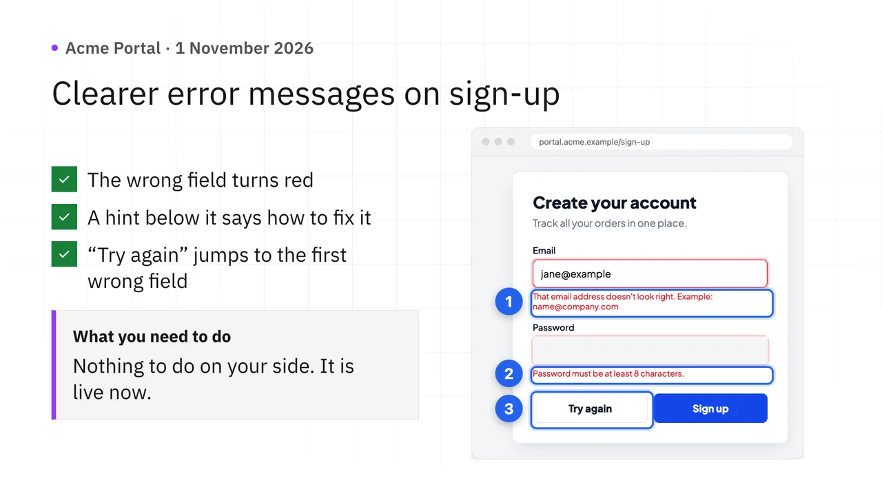
style=carbonSquare, grid-based and data-dense with IBM Plex type.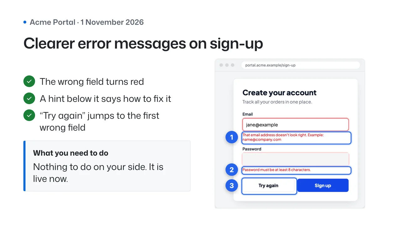
style=primerDeveloper-familiar GitHub look with diff-style red and green before/after.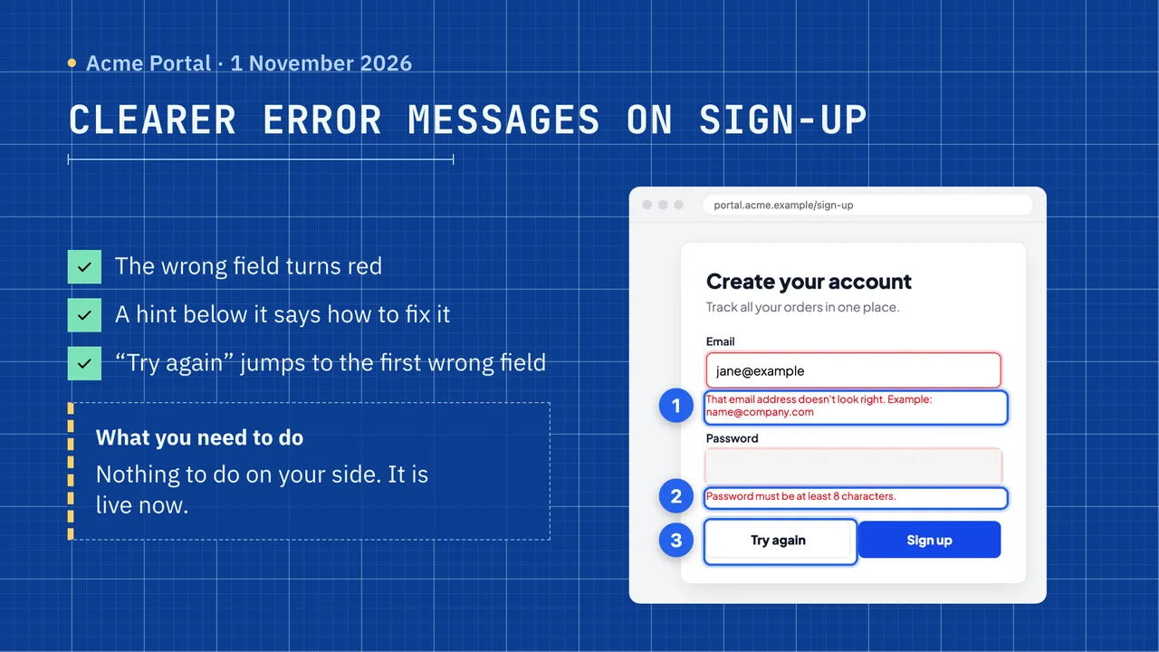
style=blueprintTechnical drawing on blue grid paper with dimension-line callouts.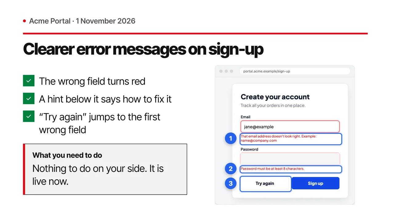
style=swissSwiss/editorial grid with huge numerals, red rules and asymmetric layouts.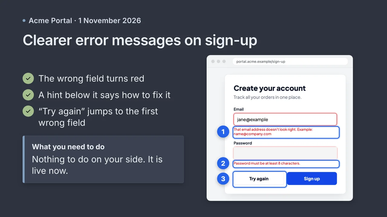
style=nordCalm arctic developer palette with frost blues and aurora accents.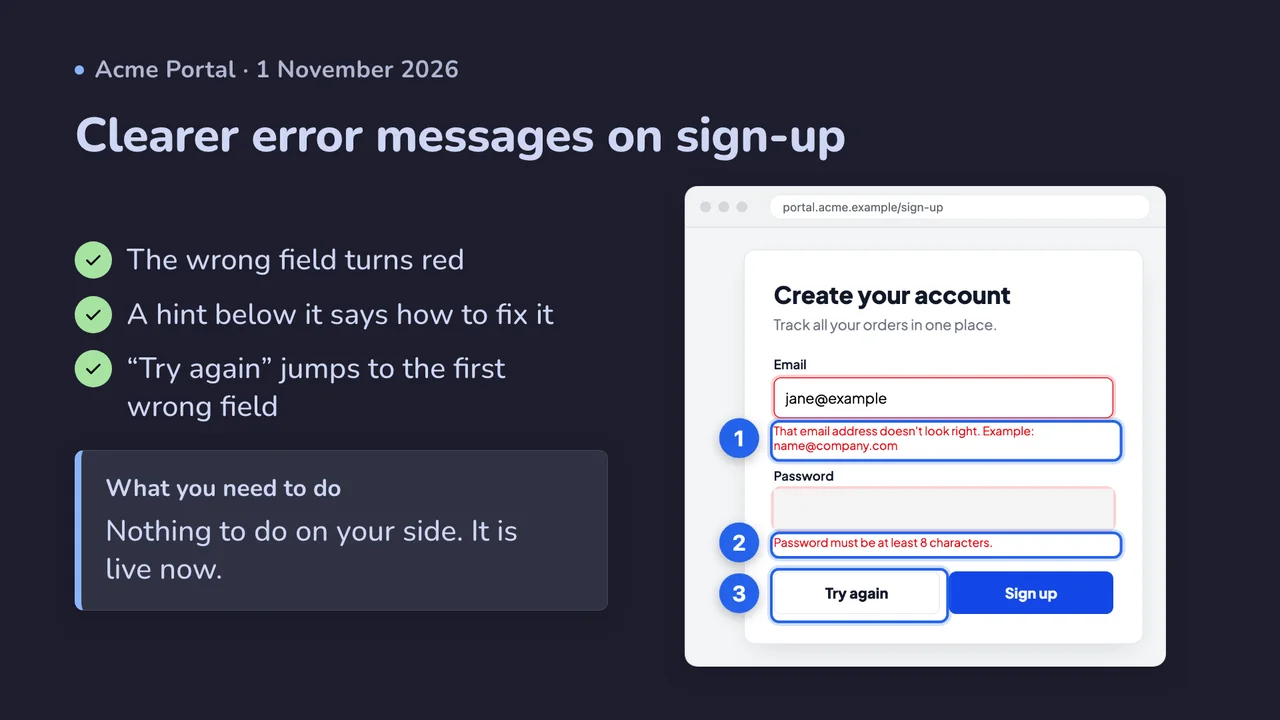
style=catppuccinSoft pastels: Mocha (dark) by default, Latte (light) as the light mode.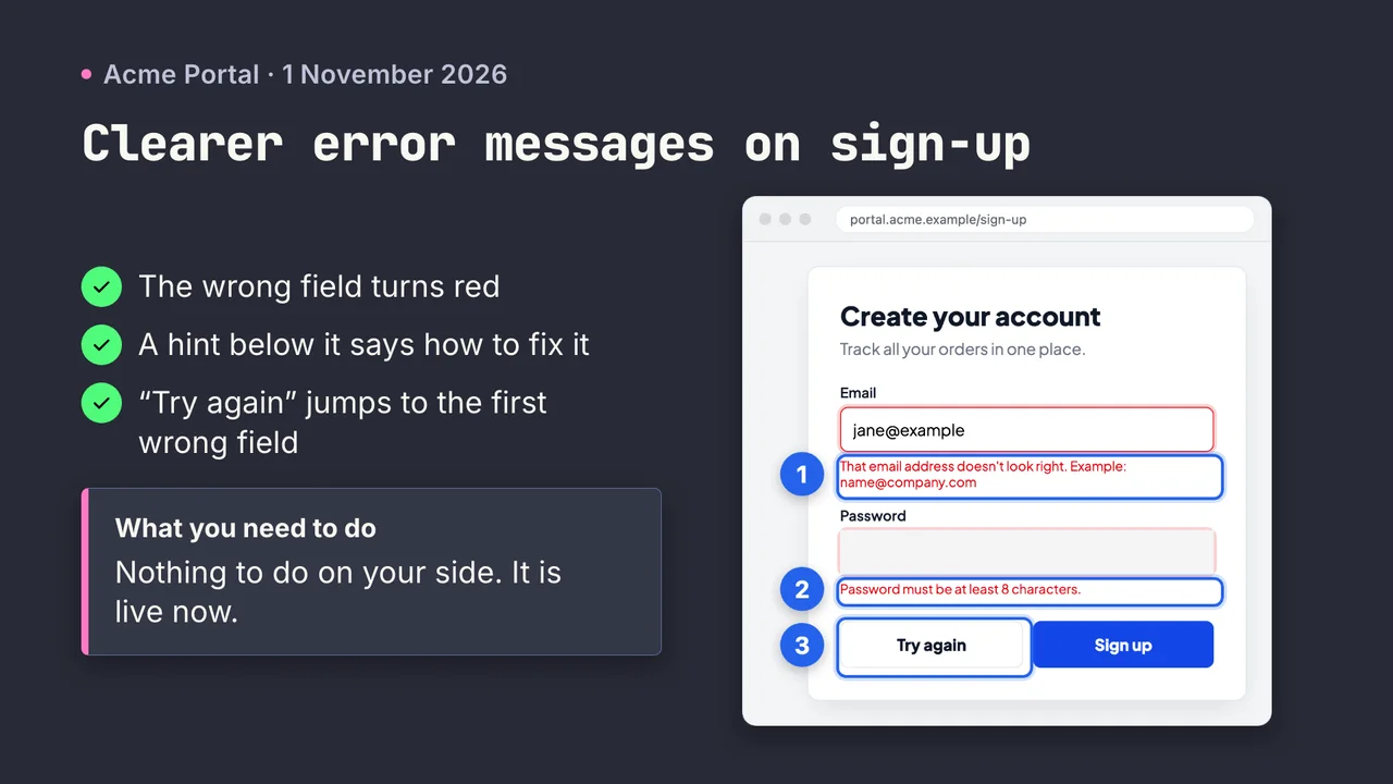
style=draculaThe classic dark developer theme: purple, pink, green and cyan on charcoal.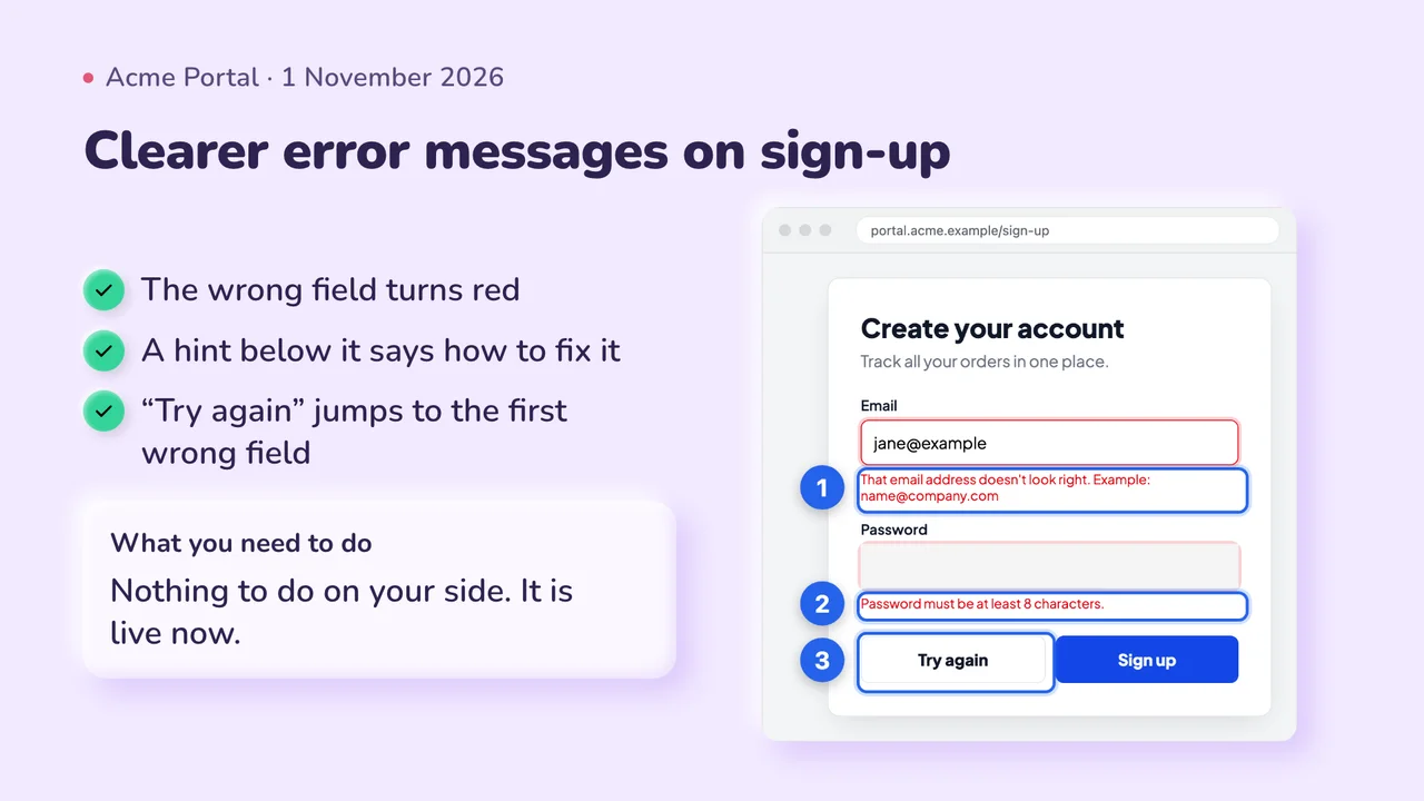
style=clayPuffy pastel 3D cards with soft inner and outer shadows. Playful.
style=executiveBoardroom and consulting look for non-technical decision makers.